The next cheese event is going to be the Ot-Brie run, an Otley Run with a different cheese at each pub.
Above is the previous poster, I would like to use the collage and digital technique again combining the two.
Above is an image of last years poster, I really don't like this poster at all now, looking back at the previous designs and re-designing them has made me realise how much has changed.
SKETCHED IDEAS!!
This is a Oreo campaign which main feature is the posters, each poster has the same type in the same position, the artwork just changes, what I like about these posters is that the colours work well and the posters complement each other well.
Here are some sketched thoughts to gather my ideas before designing, the idea I am going to go with is a mouse coming out a hole in the wall for some cheese and wine.
To start the poster I have made an outline of the wall and looked into the cheese society colours to see what colours would look best where and experiment further.
I added colour to the poster and reslised that there was too many colours with too much going on, the poster looks sickly and the 'ot-brie' run doesn't stand out enough in white on the yellow.
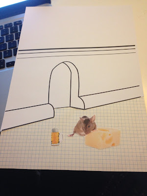
Some further experiments adding white in the design to break the colour up, the bottom is where the collage part of the poster will be, this will include graph paper to act as a tiled floor, a mouse and a beer to represent the pub crawl.
I printed off the outline, cut it out and added the collage part to the bottom of the design
Here is the poster in development, the deep orange and the blue were taken off the previous cheese poster, I think they work well together however the orange at the top takes the attention of the mouse at the bottom of the poster, I am going to experiment with making the orange lighter.
Final Poster
Making the orange lighter made the poster have more of a balanced attention all over the poster rather than just looking at the top. I also put the type on a tilt for it to go with the wall. Overall I am happy with the poster even though at times it has been a struggle with the use of colour, the cheese society has a large colour palate but it is not necessary to use all of the colours in one poster, less is more.
Social Media
Here is the poster on Facebook, where we have invited people to the event on Monday 15th, Facebook works as a good social media to advertise as people share it where more and more people see the event.


No comments:
Post a Comment