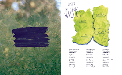
The illustration above was provided by Harriet Hobday an illustration student for Cambridge College of Art. The illustration she has created is of Hudson Valley displaying where all the famers live. The illustration will be placed in the top half of the contents page.
Brush Strokes
Once we received the illustration we then placed it in the contents page and realised it didn't quite go with the clean graphics of the front cover and the clear photography. We both became quite confused to how it would work in the publication. As an experiment and development we decided to try and add some green brush strokes throughout the publication to add to the illustrative start.
We had both hit a brick wall with the layouts and were confused to which way to take the publication, whether to make it more illustrative with the brush stokes or strip it back and go for a clean design. I added some hand painted brush stokes in the layouts to show Lydia's photography tutor. What Lydia's tutor said I agreed with, her feedback was to take all of the brush stokes out and the produce and focus on the photography and the clean design. She said the illustration at the start of the publication works well on its own as a piece of art giving the publication some context, she didn't think we should worry about trying to get the illustration to work thought the publication. With the recipes she felt it would be good if we could have them separately on postcards or a pull out, this was one of our original ideas however cost is what got in the way of us doing this. When we explained that cost was the problem she then suggested to have the recipe on its own, each recipe having its own page with an image next to it. We started to take this feedback onboard, get back to the layouts and experimenting further, taking the brush stokes and produce out, making the design clean and the focus being on the photography.


No comments:
Post a Comment