Here I have moced up the front cover of the magazine in context on a shelf next to other creative and lifestyle magazines. The design works well in context, you are initially struck by the striking photograph then the clear ‘Breathe’ type and then at a closer look that its set in Hudson Valley.
Saturday, 30 April 2016
Friday, 29 April 2016
Bootees- Branding Labels
The tshirts were all printed they now need branding. I started to look at logos before designing the tshirts but now needed to revise the designs and see how they complemented the tshirts. Working backwards and sorting the branding after designing the tshirts has worked out better than expected.
Once we had decided on the logo, I exposed the screens and began to print the black logo on the tshirts. The typeface that I have chosen for the logo is called Billy a hand drawn type that we both feel suits the hand crafted asthetic of Bootees.
Bootees- Screen print
Overall I am really happy with the way the prints have come out, I have never printed with four colours and it has been a good experience that I have enjoyed. On some tshirts we didn't apply enough pressure to the screen so some are slightly faded but that is the beauty of screen printing making each tshirt unique much like the vintage style tshirts we are going for.
Bootees- Screen Printing
The screen printing went a lot better than I thought, we started to get a production line going pinning each tshirt down and printing while other screens were drying.
Breathe- Set up for print
EX WHY ZED
I have never sent stuff off to print via email before so this was a new experience in setting up the documents ready for the printers, the publication had to be split up into two halves the covers and the inside of the document. I set the document up remembering that we are going to loose some of the middle of the publication as it is going to be perfect bound. There were more limitations than I originally expected, it has been useful doing this and I have learnt a lot putting it all together.
Thursday, 28 April 2016
Bootees- 6 tshirts 4 colours 2 days
I am now working to a really close deadline to screen print 6 t-shirts each with 4 colours in 2 days, Hollie needs them asap so she can start her photoshoots and I need them so I can brand the project as a whole.
In order to get them screen printed on time I have done a plan of when to screen print what to get them done.
Day 1
face design- yellow
oblong design- yellow
boob design- yellow
all over design- yellow
DRY
WHILE DRYING
square design- red
circle design- blue
ALL DRY
NEXT LAYER
face design- blue
oblong design- blue
all over- blue
boob design- blue
DRY
WHILE DRYING
circle design- pink
Day 2
square- pink
all over design- pink
oblong design- pink
face design- pink
DRY
WHILE DRYING
circle design- red
ALL DRY
face design- red
oblong- red
all over design- red
WHILE DRYING
square- yellow
circle- yellow
DONE
Breathe- Final Layouts
https://issuu.com/aimeeparker0/docs/final_breathe_2_cbdca51d9975ac
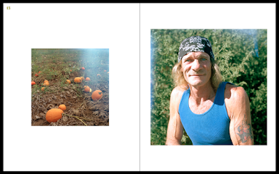
Here are some screenshots of the final layouts. After we gained feedback on the design we decided to strip it back and not be afraid of having white space in the publication and make the publication more about the photography and have the illustration as a piece of artwork at the beginning of the publication. We took all of the produce out as we had a lot of comments about it being repetitive and people couldn't understand why it was there. We have kept seeds and a small plum as they are both natural and seem in proportion in page. I am happy with the final layouts, we will test print it in digital print before sending it to Ex Why Zed for 100 copies to be printed and launch the magazine.
Subscribe to:
Comments (Atom)


