Here is some research I have been pulling together of front covers, Lydia has been very specific on what she would like on the cover, she has given me the photograph she would like on the front in a square format, there has also been much debate on whether to have a different textured GF Smith stock as an extra on the front cover, after the costings of the magazines were given she decided against the idea. After seeing the stock of GF Smith Lydia has decided that she would like a lime green colour on the front cover to complement the logo. Below are some images of front covers of magazine layout that I have been looking at to see how I can incorporate the square photograph, the colour strip, the name ‘Breathe’ being the title of the magazine and other little things to include like ‘issue 1’ and ‘summer 2016’.
Tuesday, 29 March 2016
Friday, 25 March 2016
GF Smith Colourplan- Screen Printing
Before getting the stock I started to moc up the hot-dog design on a yellow background to help choose colours, I
decided I wanted to use quite bold colours but then also thought about using a white to make the print brighter. When
the stock was arriving I wasn’t going to be in Leeds, so I got given Cool Grey instead which I was happy with as it
made the colour decisions a lot easier, I could go for bolder colours to show off the light stock. There wasn’t any major
problems when screen printing other than alignment on the three colour print.
Thursday, 24 March 2016
GF Smith Colourplan- Hotdog Design Devlopment
Once I had decided on designing a hot-dog I then started to look
at hot-dogs, textures and colours I could use. I wanted the hot-dog to have eyes and be some sort of happy character. I looked at
various American hot-dogs, I knew I wanted my screen print to be
at least a three coloured screen print as I had only ever done two
colour separation, I wanted to expand my screen printing technique
and add more colour to my design but keeping it about the paper.
YCN Fedrigoni- Evaluation
Overall I
have really enjoyed this brief, looking back our original ideas changed quite a
bit, we originally wanted to create a three dimensional window display using
the studio and making things out of paper mache, however our ideas became un-realistic
and the sea life theme we were going for didn’t suit the look of Fedrigoni at
all, although I would like to do a window display at some point in the future.
We both did
quite a lot of research to begin this brief looking into various paper craft
artists and their work, also looking into set design and GIFS as we both knew
we wanted to step away from the computer and create something three dimensional
and turn it into adverts. There are a couple of concepts that we debated going
for including the concept of the environment as this is an area Fedrigoini are
concerned about but its not necessary noticed. We decided to go with the ‘Imagine
Italy’ concept in the end, making all things Italian out of paper.
We began
working on what we wanted within the sets and the layout of them, writing lists
of what we needed and planning our time effectively to make sure we had
everything done for the deadline. We booked the photo-shoots well in advance to
make sure that we had everything ready.
The first photo-shoot
with the pasta machine went a lot better than expected, we got the photos we
needed for the GIF and the poster advert. Where we began having problems was
with the Vespa, as we didn’t have the Vespa before we made the window we didn’t
know how big to make the window so we took a guess, if photographed well we
probably could of got away with the fact the proportions were wrong however we
quickly realised that there was no link between a pasta machine and a Vespa
other than they both being Italian. Our ideas changed and developed from there.
As the Vespa
didn’t work out, we wanted to keep with the Italian theme and realised we had
already touched on food so we wanted to create a paper pizza to keep the
designs recognisable. We created the pizza set using a blue plate to match the
blue bowl within the pasta photo. We got inspiration for the paper pizza
online, using the same papers from the pasta set the pizza was created,
photographed and a GIF made of the pizza toppings falling on top of the base.
To create
the leaning tower leaflet we decided to laser cut as it is something we both
want to do more of in the near future for business cards etc. I designed the
leaning tower of Pisa to be cut out on illustrator, this worked well and we realised
we wouldn’t be able to get the logo on without screen printing. Screen printing
a small logo was difficult purely because of the size and getting the folded
leaflet lined up correctly.
For the
third and final poster we wanted to bring the concept together further to make
it stronger and tying together the colour scheme. We wanted to have silver
lettering and experiment more with processes so we decided to foil the type
onto blue paper, this went really well. Photographing the type was the
difficult part as there was many reflections within the type, looking back now
there properly was more ways to get around this however we decided to carry on
and alter our mistakes on Photoshop to create the look we wanted.
To put the
posters into context ready for submission we mocked them up on all things
London, tube adverts, London busses and newspapers to show how the campaign
would work, the leaflets would be sent door to door or displayed within the
shop.
Working
with Hollie has been good, our ideas combined has created a solid campaign for Fedrigoni,
we have learnt from our mistakes and hopefully will be doing more briefs together
in the future.
If we had
more time on this brief I think I would of liked to have spent more time
creating the pizza giving it more of a three dimensional look. Overall, I am
really happy with the campaign we have created and submitted to YCN, using different
processed to create more of a three dimensional look and getting away from the
computer has been fun.
Wednesday, 23 March 2016
GF Smith Colour Plan- Colour and Initial Ideas
COLOUR- CITRNE
Initial Ideas
I have been given the colour citrine as part of the GF Smith colour plan
archive at Leeds Print Festival, I am
really happy with getting such a bright
colour to print on. I am unsure what
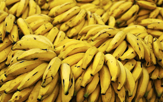
to print on it so I have began to pull together some images of yellow things that may inspire me, the design is completely open but I would like to design something that links back to the colour yellow. I like the idea of designing a vector, one idea could be a yellow beak such as a pelican or puffin, the yellow details could be left blank to show off the paper. I could also design a flower design of either a daffodil or sunflower something bright as it is now spring and summer is just round the corner. As the paper is yellow I will use complementing bright colours depending on the design. The idea I am liking the most is designing a hot-dog and the mustard can be left blank and yellow of the paper can act as the mustard.
to print on it so I have began to pull together some images of yellow things that may inspire me, the design is completely open but I would like to design something that links back to the colour yellow. I like the idea of designing a vector, one idea could be a yellow beak such as a pelican or puffin, the yellow details could be left blank to show off the paper. I could also design a flower design of either a daffodil or sunflower something bright as it is now spring and summer is just round the corner. As the paper is yellow I will use complementing bright colours depending on the design. The idea I am liking the most is designing a hot-dog and the mustard can be left blank and yellow of the paper can act as the mustard.
Tuesday, 22 March 2016
YCN Fedrigoni- Final leaflet/ Sample Booklet
This is a mini sample booklet that we have created which aims to show a small range of Fedrigoni’s papers and their
quality. We have laser cut a vector of The Leaning Tower of Pisa and then screen-printed the logo and information on
the front and back. This mini sample booklet’s purpose is to sample the paper used in the campaign so therefore has
the same colour scheme. Customers can slide each colour out from the booklet to look at its official name and feel its
texture and quality.
Subscribe to:
Comments (Atom)


